Process Analysis - Bottleneck
Process Analysis – Bottleneck
The Process Analysis – Bottleneck page allows you to perform a detailed analysis of a specific process, helping you identify where time is being spent, which activities may be causing delays, and how process performance varies across versions. Please note that this analysis only takes into account successfully terminated instances, disregarding active and canceled instances.
Page Navigation
You can analyze a specific process by selecting:
- Process Name: The process you wish to investigate.
- Process Version: The version of the process to analyze.
- Timeframe: The time interval over which data will be considered.
Once your selections are made, all visuals and metrics on the page will automatically adjust to reflect the chosen process, version, and timeframe.
BPMN Heatmap
The BPMN Heatmap provides a visual representation of process performance at the activity level.
It can be viewed in two different modes:
- Duration: Highlights activities that take longer to complete on average. Red colors indicate longer average duration and green colors shorter average duration.
- Count: Shows how frequently each activity is executed. Red colors indicate a bigger activity execution count and green colors smaller activity execution count.
You can interact directly with the heatmap:
- Select any two activities to see the average waiting time between them, helping you understand the flow and timing between key steps of your process.
- This feature is particularly useful for pinpointing slow transitions or handoffs.
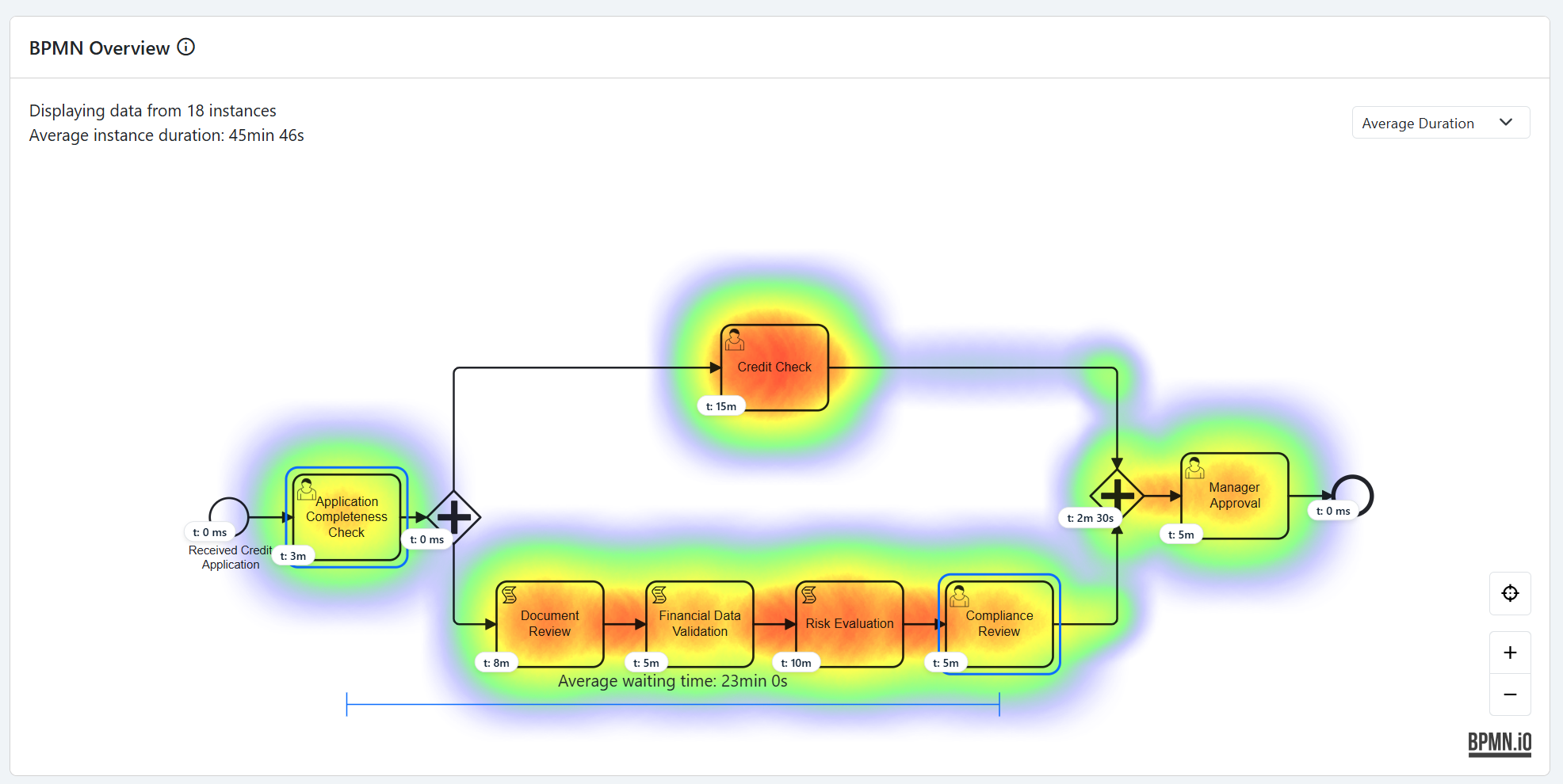
You will also find a BPMN overview of the selected process.
This visualization helps you quickly understand the structure of the process and how its activities are connected.
Instance Duration Graph and Outlier Instances
Below the heatmap, the Instance Duration Graph displays the duration of each process instance.
This helps you visualize the spread of execution times and easily identify instances that took significantly longer or shorter than average (outliers).
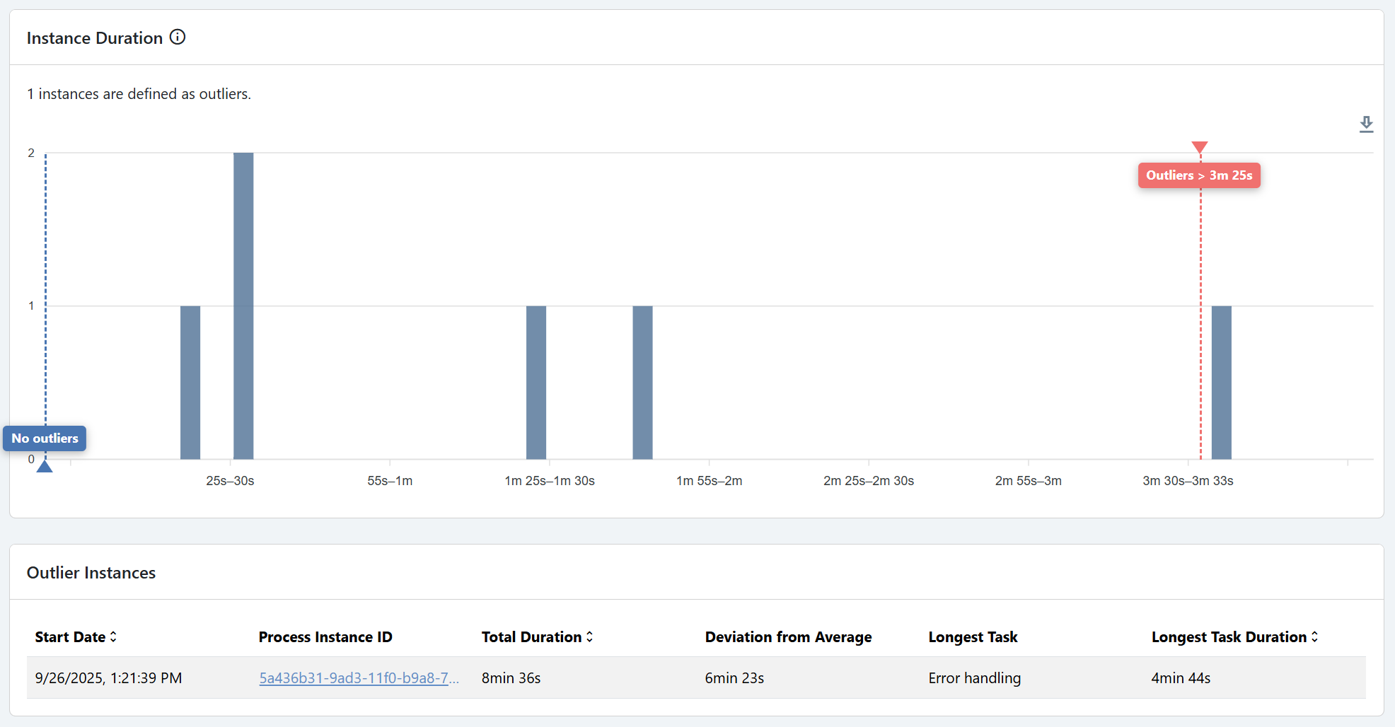
- Outliers are visually highlighted (e.g., maximum and minimum duration instances).
- A matching table lists detailed information about these specific instances, such as:
- Instance ID
- Start and end times
- Total duration
This section helps you understand not only which processes are slow but why they may be slower, by correlating instance-level data with specific activities.
This chart uses the Interquartile Range (IQR) rule to detect outliers. Any duration below Q1 - 1.5 x IQR or above Q3 + 1.5 x IQR is considered an outlier and shown in the outlier bar.
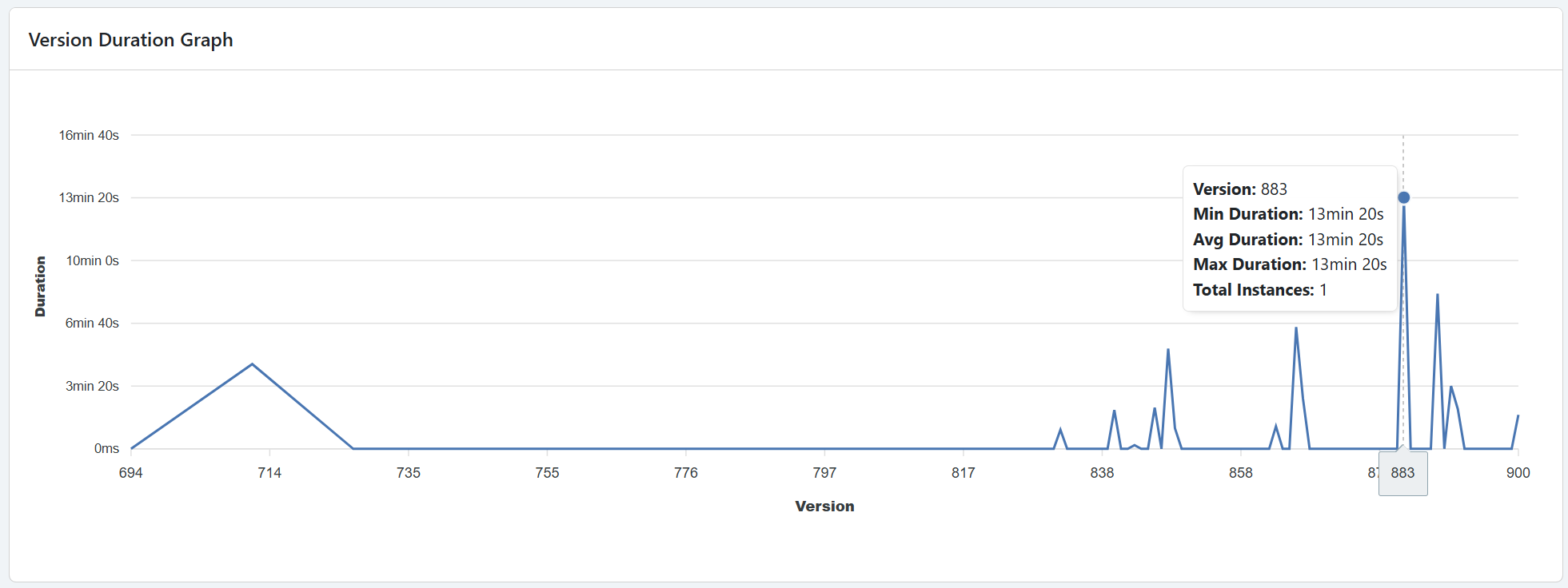
Version Duration Graph
At the bottom of the page, the Version Comparison Graph allows you to compare the average duration per process version.
This feature is especially useful to:
- Evaluate whether newer versions of the process are performing better or worse.
- Identify potential regressions introduced by process model changes.
- Support data-driven improvement and version management decisions.
Key Takeaways
The Process Analysis – Bottleneck page is designed to help you:
- Detect which activities or transitions cause the most delay.
- Understand performance variations between process versions.
- Drill down into instance-level details to find root causes of inefficiency.
- Continuously improve process execution through informed optimization.